

Written by Rebecca Friday
When the Clark Art Institute reopened its doors this summer, visitors were greeted by an astounding new building by architect Tadao Ando, expansive views of the rolling hills of Williamstown, Massachusetts, and beautifully redesigned galleries for the museum’s extensive permanent collection. With this renovation and expansion, we faced the challenge of how to encourage visitors to engage with the art in new and inspiring ways. Previously, the museum had been renting audio wands; however, these were limited to a single layer of audio and had no screen option. Thus, a new interactive interpretive system was needed to accommodate deeper layers of exploration and engagement with the collection.
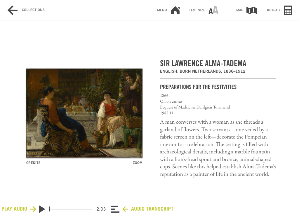
Through a grant from the Institute of Museum and Library Services, the nostalgic audio wands have been replaced by mini iPads, which we call multimedia guides – although they are so much more than that. The multimedia guide currently has 150 objects from our permanent collection, each with a zoomable image, basic information, label, and audio (along with audio transcript). Many of the objects also give the visitor the option to explore the artwork further with varied layers of content. The multimedia guide is free with museum admission or visitors can also download a streamlined version onto their personal device. The guides also include information about the Institute’s founders, Sterling and Francine Clark, special exhibitions, and a grounds map.
This interpretative project was several years in the making. Over the past two years I have worked closely with Media Manager Laurie Glover and Project Manager Viktorya Vilk to develop a system that embraced the mission of the Clark and its dedication “to advancing and extending the public understanding of art.” Central to our approach was the importance of looking at art — we did not want to detract from the importance of this practice, nor replace it with gazing at a screen. Instead, we found ways that would enhance the looking experience and point out things that visitor could not have learned otherwise. In many ways, we were inspired to the Van Gogh museum’s recent app, Touch Van Gogh, which allows audiences to examine the painterly process up close in ways never before possible.
So, how to accomplish these things?
To tackle this bold mission of active looking and learning, our process included months of brainstorming with the Clark curators and educators to decide which works of art would benefit most from additional content. We asked them what stories they liked to tell about the art, what questions they were most often asked, what special thing no one knew. From these stories, we slowly whittled down our extensive list to 150 objects and designated about half of them for additional content. Each of these objects would have no more than three or four sections of content. The content is layered, so there was an option to go deeper if there is interest but we did not want anyone to feel bogged down by the amount of content. We wanted to maintain choice in the pace the information is provided, the depth of knowledge one might be seeking, as well as a direct search for a particular artwork versus a more casual browsing of the collection.
We endeavored to create content that most enhances the visitors’ understanding of the artwork – when it can make the invisible visible and inspire curiosity for deeper learning. We found conservation stories from X-rays that unearthed hidden secrets. We found collection stories from the diary pages of our founder. We also worked with Tristan Interactive to build a semi-customized content management system and develop three kinds of interactive within the application. These include:
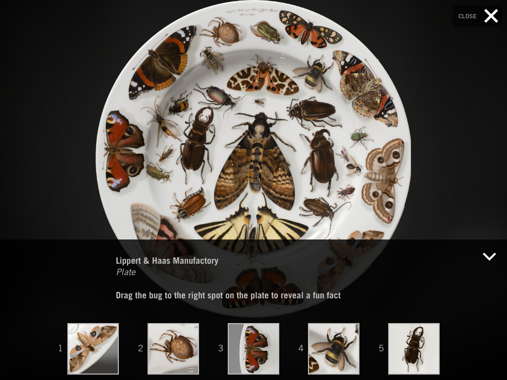
1) Drag and Drop: This interactive works sort of like a puzzle, in which small details from the artwork can be matched to the larger whole to reveal interesting details. This works particularly well for very detailed paintings because it encourages the viewer to look back up at the actual painting to find the detail in front of them.
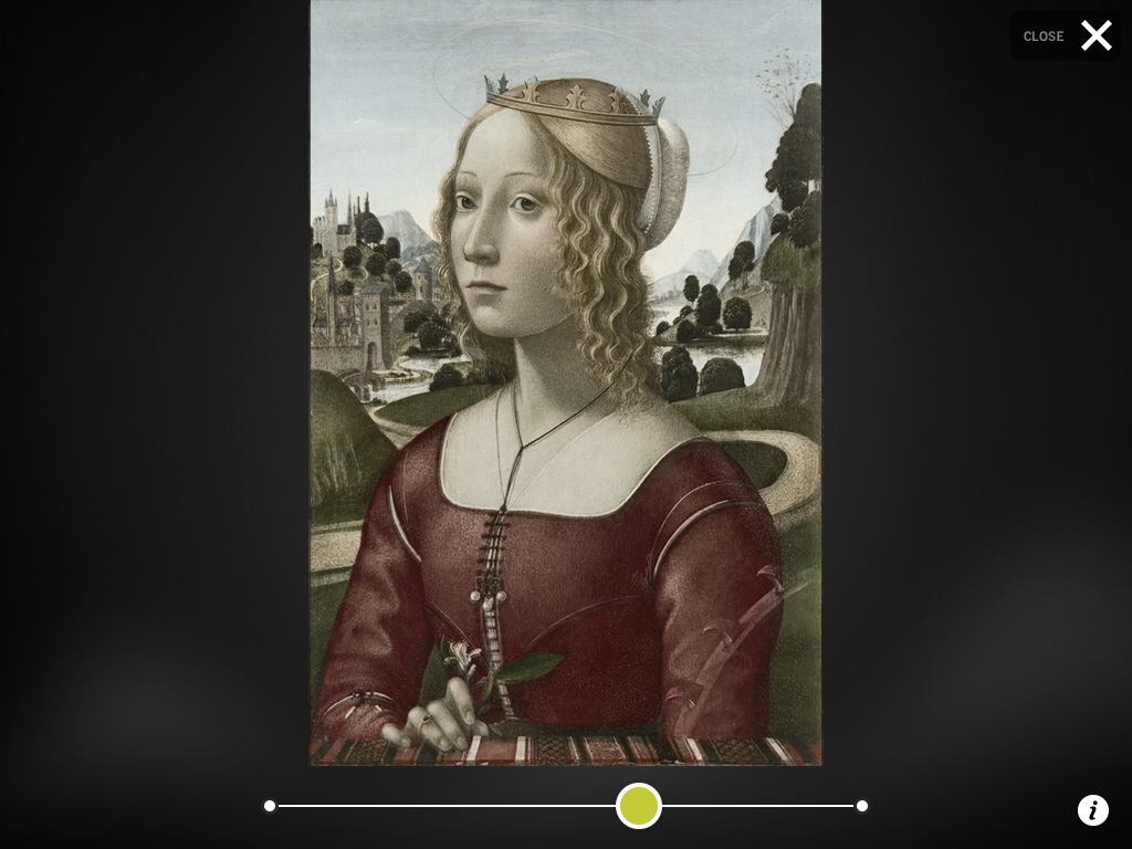
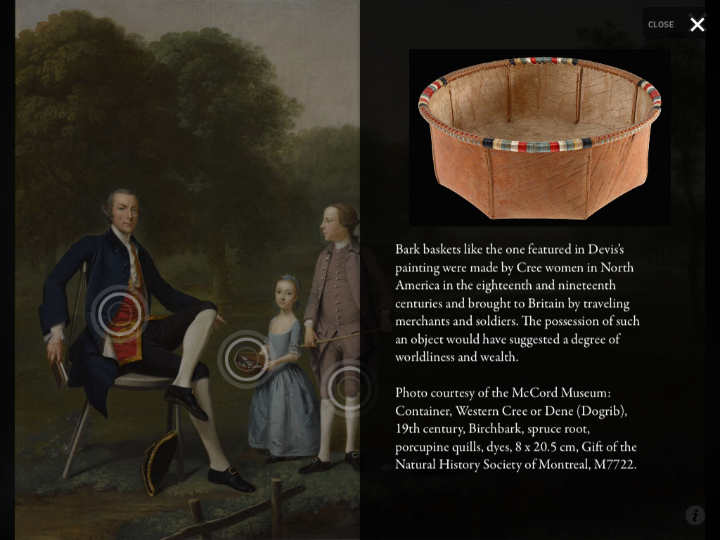
2) Slider: By sliding your finger along a scrub bar the image changes to tell a story or transform an image. For example, this feature works well with our Domenico Ghirlandaio painting, Portrait of a Lady. The transformation shows the painting pre-conservation, when the painting was altered with the addition of a halo and wheel identify the sitter (mistakenly) as Saint Catherine. One of the things that was most important was developing functionalities that could be adapted in various ways: for example, the slider could move something in space, reveal a hidden layer, or move through a narrative.
3) Hotspots: Pulsing circles appear on different part of the image – when tapped, screen pops up to reveal more information about this part of the work.
After our initial beta-build of the device we invited 80 volunteers and docents to act as a sort of focus group. We handed out the multimedia guides with a survey/set of instructions to help guide each individual through the 20-ish objects we had built into the device. The survey asked each person to the rate the difficulty of these tasks (i.e. “play the audio,” “find the Unpack Me interactive,” etc.). Because our focus group was limited to volunteers and docents, the demographic was mostly 50 years of age or older.
As we expected, there was a lot of initial confusion and outright contempt for the devices; mostly because they were perceived as new and scary. This was not a sample group that felt comfortable with technology or even used an iPhone or iPad on a regular basis. However, the more time we spent explaining their functions, the more they found joy and value in them. The less confusing the process became, the more impressed they were! Given our visitor demographic, it reinforced our commitment that the app be intuitive with lots of onscreen help. We worked with the engineers to create built in “hints” that appear on the tablet screen and encourage/guide the user.
Of course, there will always be visitors who do not want to engage with the tablets when visiting the museum. We worked hard to create something that was user friendly and, hopefully, a seamless transition from the traditional audio wand. We hope that audiences will want to engage with the collection in new and deeper ways through the expanded layers of content. Content that is presented in a variety of ways, with the belief that it will appeal to a variety of users.
As many others in the field have already noted, there is a constant grappling with the pros and cons of bringing technology into the galleries. Although I personally believe in the power of individual, intimate experiences with art, I also strongly value the communal experience that can be cultivated through conversation in front of a work of art. I can see the appeal and value of both experiences and I hope that each visitor is able to travel the path that best accommodates their needs. We chose iPad screens because they are shareable, a single headphone to make the experience less solitary, layers of content to pick and choose from. Interpretation should be available to those that seek it; it should spark curiosity and reveal what makes us love a work of art.
We have recently finished conducting an expansive survey in the Clark galleries, both with visitors who used the multimedia guide, and those who did not, to gauge it’s effectiveness, value, and possible issues that might have arisen with usability. Although we are still waiting for the concrete data, preliminary results indicate that our visitors love the app and love using the iPad minis. They enjoyed using the interactives, sharing tidbits with their family and friends, and listening to the audio components. However, those that did not take the device, often voiced negative comments about it. It seems the negativity is rooted in the unknown – something that is new, possibly complicated, and technological.
As is often the case on ArtMuseumTeaching (and a very valuable case), I’d like to open the floor to all of you. What are your thoughts on the future of technology in museum galleries? What are its positive effects and what are the possible criticisms it faces? Can an iPad screen really enhance a solitary and personal experience with a work of art? Or is that kind of thinking becoming increasingly elitist and limiting to everyday audiences?
About the Author
 REBECCA FRIDAY: Rebecca earned her Bachelor’s Degree from Sarah Lawrence College and Master’s Degree from Williams College, both in Art History. She spent the last two years working as a Curatorial Assistant at the Clark Art Institute. In addition to her contributions on the multimedia guide project and interpretation of the reinstallation of the permanent collection, she also served as curatorial coordinator for Winslow Homer: Making Art, Making History, Cast for Eternity: Ancient Ritual Bronzes from the Shanghai, and Radical Words: From Magna Carta to the Constitution. Prior to her position at the Clark, Rebecca worked at the Williams College Museum of Art as well as several New York City art galleries, including Galerie St. Étienne and Robert Miller Gallery. She is currently looking for her next adventure in museum interpretation. Rebecca tweets at @Fridayfridaygrl. Rebecca’s postings on this site are her own and do not necessarily represent the Clark Art Institute’s positions, strategies, or opinions.

This is surely a model of how we should all proceed. Thoughtful, wise, jargon-free, considerate of other points of view, experimental, and clever. Warmest congratulations to you, Rebecca, and to all those involved with you in this project.
Thank you for your kind words!
What a thoughtful, well-articulated article. Two points you made, “Central to our approach was the importance of looking at art — we did not want to detract from the importance of this practice, nor replace it with gazing at a screen,” and “We chose iPad screens because they are shareable, a single headphone to make the experience less solitary…” show a real sensitivity about preserving the museum experience while bringing in new, and complementary, technologies.
I commend The Clark for testing the iPad program with an older audience. I know that the hope when introducing new, and possibly intimidating, things to an established routine is that the current visitors won’t be isolated by them. However, I think the Clark is making the right decision to integrate computer capabilities in order to capture and hold the attention of a younger generation who may not see the relevance of a traditional museum to their plugged in lives.
This was an excellent read! Thanks for the window into your process.
Thanks for your comment! Yes, we wanted the multimedia guide to enhance the experience of collection (for visitors of all ages!) and we worked really hard to maintain that while creating content and choosing hardware, devices, etc.
I’d love to come check out the ipads and experience them for myself. I love the slider idea with pre- and post- conservation photos. Everyone loves those! As a parent, I think about the logistics of carrying around an ipad in addition to the other things one carries around with a child in tow. I also would be curious to see how often people “look up” while they’re using the ipads. Will you be doing visitor studies on that?
Becca, that is a very valid concern. The iPad minis actually come in plastic cases with a strap that can been worn on the shoulder or around the neck (like a traditional audio wand). Hopefully, this makes it easier to juggle with a child in tow! Also, we did not specifically ask about “looking up” in the visitor study we recently conducted but I think the questions were constructed in a way that will help use to determine in what manner the guides are being used and interacted with in the galleries. That would be an interesting study though!
Thanks for this exciting and thoughtful post, Rebecca (also hi to Viktorya!).
I’m also curious–like Becca above–about the “looking up” element as these guides get more and more use. I’ve found that sometimes, despite our best museum education intentions to further close looking, when there are more interactive things to do on device screens, some people spend more time doing that than looking at the art.
This is hardly a new concern, and I’m interested to see how it plays out for you. I’m always interested to see what happens when tools that we museum pros intend to encourage careful object observation actually get out into the hands of the public.
I’d love to hear more from you on this project in the coming months.