
Written by Mike Murawski
Reposted from CODE | WORDS, an experimental publishing project on Medium exploring emerging issues concerning the nature of museums in light of the impact of digital technologies on society. This collection of essays has since been published in book form by Museums Etc.
As the AMC series Mad Men aired its midseason finale back in May 2014, more than two million viewers were graced with an unexpected song and dance performance from senior advertising executive Bert Cooper, played by actor and past Broadway star Robert Morse. In this musical equivalent to hitting the pause button on a much anticipated final season that does not resume until next spring, Morse crooned the lyrical lines first written in 1930: “The moon belongs to everyone; the best things in life are free.”
For me, it was certainly one of the most intriguingly beautiful and surprising moments on television in recent years. The song comes during the last two minutes of an episode in which the daily dramas of the show’s characters are laid on top of, and intertwined with, the 1969 Apollo 11 moon landing. At one point in the episode, everyone gathers around a television, wherever they are, to watch Neil Armstrong take that small step onto the surface of the moon — engaging in one of the most memorable shared human experiences of the 20th century (an estimated 600 million people worldwide were watching the moon landing live on television at that very moment).
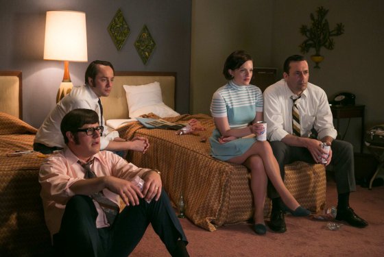
Technology, engineering, and new media undeniably acted to create a profound connection. In her Los Angeles Times column about the Mad Men episode, Meredith Blake wrote:
“It was an unexpectedly hopeful hour of television, one that reaffirms the possibility of positive collective experience while contradicting the notion that technological progress must come at the expense of human connection.”
This perspective has particularly resonated with me at a time when I have been grappling with the effects of digital technologies and media on the educational role of museums. Are my own core values of human connection, shared experience, and community co-creation a part of the digital transformation happening in museums? When we’re overly suspect of digital technologies, are we missing out on a greater opportunity to embrace a ‘digital is everywhere’ mentality—a mindset that brings together thinking about digital technologies and the new ways in which humans connect, share, and learn in a digital age?
Yes, and yes.
Well …. how did I get there?
In May 2013, I gave a talk at the Museum of Contemporary Art in San Diego (followed by a short thinking piece online) entitled “Museums Un/Plugged: Are We Becoming Too Reliant on Technology?” that explored my uncertainties about the growing emphasis on technology in museums. Far from being anti-technology, I was, however, exploring some burning questions I, myself, had about the role of digital technology in museum learning and visitor engagement through the polemical dichotomy of ‘plugged in’ versus ‘unplugged.’ Among many questions, I asked:
“As we focus more and more on digital and online experiences, are we sacrificing any of the human-centered elements that have been at the core of museum education for more than a century? If your museum lost power, how would that affect the learning experiences in the galleries and across programming?”
After seeing some museums investing more in a single digital project than other museums have in their entire annual operating budget, I was genuinely concerned that we might be losing sight of the basic ‘unplugged’ human interactions at the core of learning that allow these institutions and their collections to have public value and mean something to the communities they serve. I even wrote, “when I head into the galleries to facilitate a learning experience, technology often falls away and I find myself focusing entirely on the analog elements of museum teaching.”
Yet, I have come to realize that we can no longer unplug the effect of digital technologies and Internet culture on the ways we think about and re-imagine museums today. If the lights go out in the museum and all the WiFi hotspots and screens go dark, we might lose the physical technology infrastructure, but we do not lose the powerful participatory, networked, open source culture that has taken root in our audiences and communities in the 21st century. In this regard, digital technology cannot simply fall away.
In the 2014 Let’s Get Real 2 report developed from the second Culture24 Action Research Project involving 22 arts and cultural organizations, experts from across the field noted that institutions are struggling to embrace the new realities of audience behavior (via the web, mobile devices, social media, etc.). Jane Finnis, Project Lead, remarks in her foreword to the report:
“this challenge is absolutely not about technology, which we are often guilty of fetishising as a solution to problems. It is first and foremost about audience and the ways in which digital technologies are changing their behaviours: at work, at home, on the move, learning, playing, questioning, socialising, sharing, communicating. Forever.”
For museums in the 21st century, becoming more aware and responsive to these changes requires a shift in thinking at all levels — a shift that embraces a wider ‘digital mindset.’ This approach envisions a deeper fluency and understanding of web behaviors, mobile behaviors, and social media behaviors across all areas of museum practice, rather than relegated to the IT, online collections, or website functions of a museum. In her core essay from the 2014 Sharing is Caring anthology (a must read, by the way) entitled “This Belongs to You: On Openness and Sharing at Statens Museum for Kunst,” Curator of Digital Museum Practice Merete Sanderhoff sets out to define “a new foundation for our work, one that comprises digital infrastructure and a digital mindset in equal measure” (23). She continues:
“Technology should not govern the museums’ work. But in order to learn and understand how we can use new technologies and benefit from the opportunities they open up for us, we must explore and incorporate not just technologies themselves, but also the changes in behaviour and expectations they prompt in users. We must think like users.”
So how might we begin to think more like users, and see our audience as users, as well?
Be More Open
With the rise of the Internet, the phrase ‘open source’ began as a way to describe open access to software source code and the collaborative model for how it is developed. Key elements of this development model have been: universal free access and redistribution of the source code, an openness for users to modify and adapt that blueprint in any way desired, and an emphasis on transparency and collaboration.
In museums today, one of the direct effects of this open source movement can be found in the ways through which institutions have released their collection data. As the OpenGLAM (Galleries, Libraries, Archives, and Museum) initiative coordinated by the Open Knowledge Foundation asserts:
“The internet presents cultural heritage institutions with an unprecedented opportunity to engage global audiences and make their collections more discoverable and connected than ever, allowing users not only to enjoy the riches of the world’s memory institutions, but also to contribute, participate and share.”
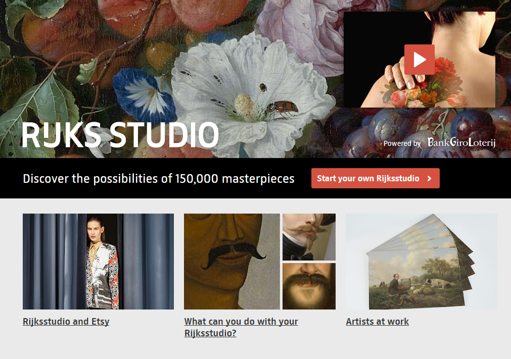
In 2013, the Rijksmuseum released 150,000 copyright-free, high resolution images of public domain works — one of several art museums that have made collection data and images openly available online. But they have gone beyond simply releasing images and data, and actively encouraged people to share their collection, remix the artworks to create personalized collections, print reproductions (including everything from posters and canvas prints to coffee mugs and bed covers), and allow artists free reign to use these images to create something new. As of October 2014, visitors had created more than 169,000 new virtual exhibitions through the RijksStudio web platform. Ed Rodley’s recent CODE | WORDS essay “The Virtues of Promiscuity” lays out an interesting case for museums like the Rijksmuseum being promiscuous with its collection.
Pushing open use of a collection even farther, in January 2014 the Walters Art Museum hosted its second Art Bytes hackathon to bring together technology and creative communities to use the museum’s rather new API to create games, Twitter bots, scavenger hunts, 3D prints, web apps, e-books, digital docents, etc. This competition not only utilized the collection data to inspire community-wide creative rethinking about the Walters, but it led to a whole series of incredible adaptations, recreations, and visitor experiences with the collection at the core.
One of Denmark’s leading IT lawyers, Martin von Haller Grønbæk, writes in his essay “GLAMourous Remix: Openness and Sharing for Cultural Institutions” from the 2014 Sharing is Caring anthology:
“All cultural institutions should endeavor to be as open as possible in the sense that as many people as possible should have the easiest access possible to the institution’s content. At the same time the institution should seek to ensure that the freely available content is shared, enriched, and processed by users, whether they are citizens, students, scholars, researchers, or commercial ventures.” (142)
If we think of the concept of ‘open’ in the broadest way possible (beyond releasing collection data), it has the potential to challenge museums to let go of some of their control and the limitations that come with this control. Embracing a mindset of openness changes the way we think about museum practice, inspiring a more participatory mentality focused around creating, transforming, and adapting — without the traditional restrictions that have limited forms of public cultural learning.
Redefine Authority
“With the web has come a new collaborative approach to knowledge generation and sharing, a recognition of multiple perspectives, and an expectation by users that they will be able to contribute and adapt/manipulate content to meet their own needs.” (Graham Black, Transforming Museums in the 21st Century, 6)
A hundred years ago, people relied on museums as a repository for the knowledge and information related to its cultural collections. If you wanted to learn more about the artists, artworks, cultures, and places of its collection, you walked inside a museum’s grand halls of knowledge. Today, that has completely shifted. Visitors can access far more information through their smartphone or mobile device than any museum could ever hold (as of October 2014, 87% of people in the US use the Internet, 67% own smartphones, and they have access to more than 672 billion gigabytes of data from more than 1 billion websites).
During a visit to the Nelson Atkins Museum of Art in Kansas City, I found myself sitting in front of an amazing Franz Kline painting entitled “Turin” in their Abstract Expressionism collection. While the pithy 98-word unattributed ‘voice of god’ label offered a few tidbits (“Kline used commercial house paints,” and that the painting was “named after a city in northern Italy”), I quickly went to my iPhone to search for more—I was hungry for more. From the 350,000 Google search responses, I instantly found videos, photos, Wikipedia entries, curatorial essays, poetry, music, visitor comments, slow looking reflections, and links to dozens of other museums that had works by Kline in their own collections. While I may have been standing in the Nelson Atkins building, I found myself reaching outside of its walls and connecting digitally with a wide distributed network of authorities and communities of knowledge—even sharing my own content to this mix with tweets and Instagram photos. When I sat down with docents in front of this painting for deeper conversations, we opened up further layers of thoughts, insights, and questions that were not part of the authoritative knowledge repository of the museum.
We have rapidly moved out of the era of passive consumption of content selected by a few experts, and museums now have an opportunity to actively reshape their own authority in this new equation. The digital age does not negate the authority of museums and curatorial expertise, but, rather, it puts this authority in public conversation and dialogue with a wider network of knowledges, voices, and experiences. Cultural authority is not something solely established by a didactic label, curatorial essay, or published catalog; it is negotiated through discussion and collective participation, and shared with our community and the users (yes, I said ‘users’ instead of ‘audience’). with which we connect. In his 2009 essay “A Manual for the 21st Century Gatekeeper,” New York-based curator Michael Connor explores the ways in which the internet, social media, and new collaborative ways of working are fundamentally changing the relationship between arts organizations and their audiences. He writes:
“A curator’s authority pales in comparison to the audience’s vast collective stores of knowledge and passion. How can gatekeepers redefine their role in ways that harness the power of the audience without losing the sense of subjectivity and personal risk that lie behind aesthetic decisions?”
As museums work toward sharing authority, they can begin to allow for the voices of specific communities and the public to be heard inside the walls of these institutions—to speak for themselves. In her guest editor preface to the July 2013 issue of the Journal of Museum Education focused on this theme of “shared authority,” Elizabeth Duclos-Orsello includes a powerful quote from historian Karen Halttunen that relates to the role museum staff play as workers in these public institutions:
“We [must] divest ourselves of the special authority sometimes granted to us … [and we must] enter democratic partnerships with other members of our communities.”
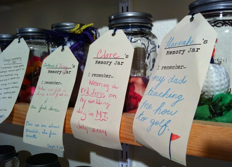
For me, the Memory Jar Project a couple years ago at the Santa Cruz Museum of Art and History really stands out in terms of a museum working to renegotiate traditional, monolithic structures of authority (using a ‘digital mindset’ in an analog way). Part of a larger community-sourced exhibition project called Santa Cruz Collects, visitors were invited to ‘bottle up’ a memory in a jar, label it, and leave it as part of this exhibit to share with others. The Portland Art Museum’s Object Stories initiative also continues to strive toward shared authority and multiple voices (see “Sharing Authority/Sharing Perspectices: Native Voices”). By redefining authority through these processes of co-creating knowledge and meaning with the community, a museum has the potential to be far more than just a place that holds and disseminates knowledge.
Get Connected
At the core of the digital age are new ways of relating to one another, new ways of interacting, new kinds of groups, and new ways of sharing, learning, collaborating, and connecting. In their 2012 book Networked: The New Social Operating System, Lee Rainie and Barry Wellman argue that the large online social circles of familiar platforms such as Facebook, Twitter, Pinterest, etc. actually expand opportunities for learning, problem solving, and personal interaction. Their work at the Pew Internet Project and the NetLab (especially research for the Connected Lives Project) suggests that digital technologies are not isolated — or isolating — systems, but rather networked systems built upon these social networking platforms as well as mobile device technologies.
“People’s relationships remain strong — but they are networked. Neighbors, and neighborhoods still exist, to be sure, but they occupy a smaller portion of people’s lives. It is hard to borrow a cup of sugar from a Facebook friend 1,000 miles away, but it has become easier to socialize, get advice, and exchange emotional support at whatever distance. Where commentators had been afraid that the internet would wither in-person ties, it is clear that they enhance and extend them.”
Through countless digital projects and social media activities, museums are tapping into global networks and becoming more connected to this growing virtual community (that, in many cases, actually has a strong relationship with a museum’s physical community). As Paola Antonelli, senior curator of architecture and design at the Museum of Modern Art, stated in a 2014 New York Times piece, “We live not in the digital, not in the physical, but in the kind of minestrone that our mind makes of the two.”
Through the Portland Art Museum’s #captureParklandia project, we were able to effectively explore the interconnected network of interest-based social media communities (via Instagram) and the physical communities in Portland itself. The overall reach of this project through Instagram was far larger than the museum’s annual in-person attendance, motivating us to rethink how we define our audiences and the new ways in which we might bring them together through moments of exchange. Rob Stein explores related ideas in his CODE | WORDS essay “Museums… So What?”, writing:
“… the face-to-face dialog that happens in real life at the museum is critically important, but I keep thinking about all the ways we could enhance and improve this dialog digitally and online. What if we considered how we might detect when meaningful discourse happens in our social media and online activities?”
The Question Bridge project is a particularly powerful example of using digital technologies in a participatory way to bring people together in dialogue and exchange. Organized by artists Chris Johnson and Hank Willis Thomas in collaboration with Bayeté Ross Smith and Kamal Sinclair, this innovative transmedia art project aims to facilitate a question-and-answer dialog between black men from diverse and contending backgrounds and create a platform for representing and redefining black male identity. In addition to its online interactive site, the project has been installed at over 25 museums and galleries, including the Brooklyn Museum, Fabric Workshop and Museum, Milwaukee Art Museum, Oakland Museum, Cleveland Museum of Art, the Exploratorium, and the Missouri History Museum, and includes a multiple-screen video installation as well as a youth development curriculum and specialized community engagement events. The project (about which I encourage you to learn more) is all about dialogue and listening, and it taps into both technology and a digital mindset in order to enhance the connective and collective experience of participants in a digital age.
* * * * *
In her book Museums in the Digital Age, Susana Smith Bautista discusses how notions of place, community, and culture are changing for museums in the digital age. In her conclusion, she writes:
“If museums are to remain relevant, vital, and meaningful, then they must adapt to a changing society, which means not only recognizing and incorporating new digital tools for communication, but more importantly, recognizing the changing needs and aspirations of society as reflected in their communities of physical and virtual visitors.” (225).
As the behaviors of our audiences and communities change, so do the ways in which they learn. A core part of this digital transformation in museums (see “Museums Morph Digitally”) involves expanding our concepts of learning and engagement to be responsive to an Internet culture defined by participation — and not just ‘participation for the sake of participation,’ but as serious involvement in the deep, connected forms of cultural and creative learning that can occur with museums.
Embracing a digital mindset of openness, participation, and connectivity allows museums the chance to extend the boundaries of what is possible, and serve as sites for profound human connection in the 21st century—in much the same way that new technologies brought people together for that powerful shared moment 45 years ago to witness Neil Armstrong’s ‘giant leap.’
After all … the moon belongs to everyone.

* * * * *
UPDATE
On November 12, 2014, the NAEA Museum Education Division hosted a Peer2Peer Hangout that focused on these ideas of ‘digital mindset’ and ‘digital museum practice’ with Ed Rodley, Chelsea Kelly, Michelle Grohe, and Juline Chevalier. It was a lively conversation with lots of good questions from people watching live. View the video archive of this Hangout below: